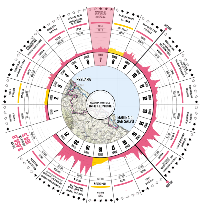
This month the prestigious grand cycling tour, Giro D’Italia is off and running and on the Giro d'Italia official site, there is this great infographic / volvelle outlining each stage of the three week race which is all whiz-bang animated whenever you choose a stage. Each segment shows the start and end towns, the total distance, the date it will run, an overview map of the stage, links to more technical information, the points available (or difficulty rating; the more difficult the more points in play) and most importantly, the elevation change. I hadn't really been using the official site as I've been getting all my updates in Twitter or from cycling blogs. At first glance it looks like any other Flash thing, but looking under the hood it’s a curious mix of bootstrap.js library and images. It’s an impressively compact design that shows the progression of the race over 21 days. I’m a little surprised they didn’t go further in making the text and graphs CSS or use an interactive OpenMaps. Still, it’s a pretty neat way to see all the information in one place no matter how it is built.
I've always said there is strange nexus where designers, typographers, coffee aficionados and cyclists meet and the Giro is one of those events that perfectly encapsulates that.